© 2025 Blaze Media LLC. All rights reserved.
What is the true infection fatality rate of COVID-19, broken down by age and health status? This is a simple question for which the CDC should have a clear answer by now, accompanied by a readable chart – a chart showing everyone’s demographic risk assessment so that we can better target our infection mitigation efforts. Yet it’s the one thing our government hasn’t done. Wonder why?
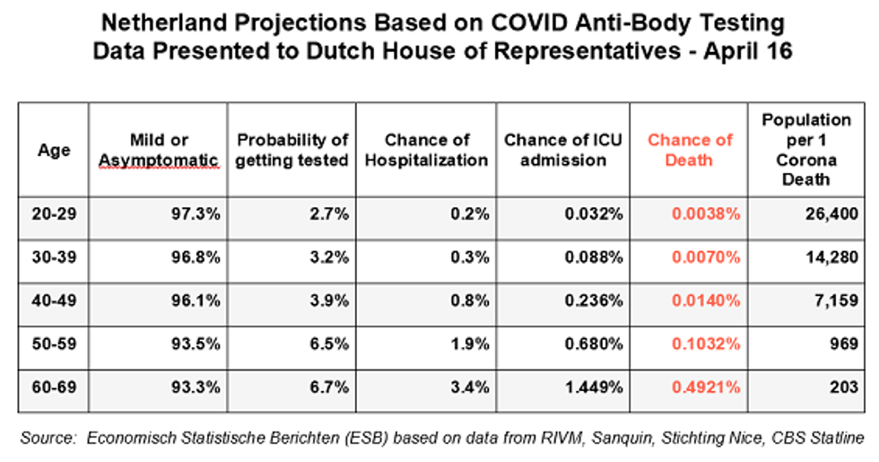
Take a look at this chart (which I translated into English using Google Translate) prepared by the Economisch Statistische Berichten (ESB), a Dutch economics magazine, quantifying the infection fatality rate for the Dutch population based on age bracket. The data were calculated from an antibody test of 4,000 blood donors conducted by Dutch blood bank Sanquin to see how many have been infected for the purpose of donating blood plasma to those currently suffering from the virus. The data were presented to the Dutch House of Representatives in mid-April by the National Institute for Public Health and the Environment (RIVM).
Based on this serology test, they were able to determine that 3% of the population (at the time) were infected and were therefore able to divide the numerator of those who died of COVID-19 by the extrapolated denominator of those who were likely infected and break out the infection fatality rate by age group.
Study this chart for a few minutes and take in all the data – from the asymptomatic/mildly symptomatic rates to the hospital and fatality rates divided by age. You have to get to the 50-59 age group just to reach a 0.1% fatality rate, the level often cited as the overall death rate for the seasonal flu. Those are all lower odds than an individual has of dying in a giving year of any cause and in the case of an average 50-year-old, five times lower.
They didn’t test kids under 20, but their fatality rate is likely near zero.
While the Netherlands is an entirely different country, it has actually experienced a 30% higher death rate per capita than America. So the numbers are likely not any higher here for those under 70, especially because the macro serology tests showing a 0.2% fatality rate (but grossly distorted by the death rate of those over 80), as well as what we are seeing in prisons and ships in younger populations, seems to harmonize with this data. A brand-new study from France also shows very similar estimates of fatality rates, at least for those under 60.
If anything, those who are sicker tend to stay away from blood donation, so it could be that infection rate was even higher than this sample suggests, thereby driving down the fatality rate even lower.
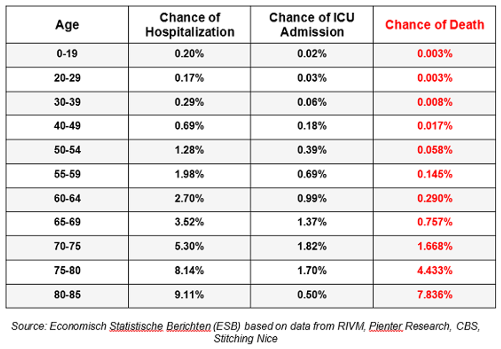
Moreover, several weeks later, another research group in the Netherlands did a second serology test that broke down even more groups and came up with almost identical results:
As you can see, the death rate doesn’t even climb above .1% until you reach over 70, with a steep and dangerous growth of risk over 75 and 80. However, it’s important to remember that even those death rates might need to be cut in half for those outside nursing homes, given that half the deaths in most countries are in senior care facilities.
Why has our government not put out a similar chart? How many Americans even know that children have near-zero threat and anyone under 60 has next to no risk of dying from the virus? Even those between 60 and 69 are at much lower risk than anything the government has suggested and that the level of panic indicates. The World Health Organization wrongly pegged the overall death rate for all ages at 3.4% on average. This simple fact makes a world of difference both to our targeted response to the virus and also to the degree of panic that should and should not be infused into society so as not to keep people away from hospitals when they are experiencing other potentially dangerous medical conditions.
But even this chart doesn’t tell the full story. The virus lopsidedly targets people with particular underlying conditions, such as heart disease and diabetes. It is simply criminal that, with the tens of billions of dollars in “emergency” funding, the CDC has not conducted or published the results of a survey of 20,000 or so Americans to determine the exact number of infections and the fatality rate broken down by each health and age status. To most Americans, based on what the government and media have been putting out, it’s all the same and even babies will all die, as if there is a 50% fatality rate. Most people I know think their infants are in danger from COVID-19, even though the threat of flu and SIDS is much more pervasive in infants than that of coronavirus.
Hence, the fatality rates from the Netherlands are likely much lower for healthy people. Remember, these fatalities rates are calculated by dividing the total deaths in that age group by the total extrapolated and estimated infections that have gone untested and unrecorded. But the numerator is lopsided, because almost all the actual deaths are among those with three or four very specific health problems. What is the fatality rate for a 70-year-old without those conditions, much less someone much younger? Clearly, a lot lower, and we need to know that data.
In most states, well over 90% of those who died of COVID-19 had serious underlying conditions. But it’s even more than that. We now know that geography played a large role. 54% of all U.S. deaths were in the 100 counties in or within 100 miles of NYC.
Chart: #COVID19 is an NYC-centric pandemic. I put counties in buckets ("bins") 100 miles from NYC - The length of… https://t.co/wursWLObZG— Justin Hart (@Justin Hart) 1589168745.0
Moreover, roughly half of all deaths outside New York were in nursing homes. So, if you actually took the numerator of COVID-19 deaths, which are calculated very liberally, and limited them to the risk of those outside the NYC area and outside nursing homes, what would the fatality rate be? Likely much lower, even for those with underlying conditions, much less those without them.
Consequently, we destroyed our entire country and sacked the Constitution all for a very narrow and specific problem that required a precise and balanced approach. Yet two months into this mistake, our government won’t even put out the simple math demonstrating this obvious point. As one commentator so aptly observed, “Homogenous intervention in the face of heterogenous risk is just cruelty passed off as equality.”
Want to leave a tip?
We answer to you. Help keep our content free of advertisers and big tech censorship by leaving a tip today.
Want to join the conversation?
Already a subscriber?
Blaze Podcast Host
Daniel Horowitz is the host of “Conservative Review with Daniel Horowitz” and a senior editor for Blaze News.
RMConservative
Daniel Horowitz
Blaze Podcast Host
Daniel Horowitz is the host of “Conservative Review with Daniel Horowitz” and a senior editor for Blaze News.
@RMConservative →more stories
Sign up for the Blaze newsletter
By signing up, you agree to our Privacy Policy and Terms of Use, and agree to receive content that may sometimes include advertisements. You may opt out at any time.
© 2025 Blaze Media LLC. All rights reserved.
Get the stories that matter most delivered directly to your inbox.
By signing up, you agree to our Privacy Policy and Terms of Use, and agree to receive content that may sometimes include advertisements. You may opt out at any time.


